Project:
The Last Generation
Awards Update
The Last Generation has been honored with these awards:
- World Press Photo: Interactive of the Year
- Emmy: Outstanding New Approaches, Documentary
- Webby: Best Use of Interactive Video
- duPont-Columbia University: Gold Baton, 1 of 8 FRONTLINE projects
- Online Journalism Award: Excellence and Innovation in Visual Digital Storytelling
- Overseas Press Club: Citation, Kim Wall Award
- Scripps Howard Award: Multimedia Journalism
- National Academy of Sciences: Communication Award
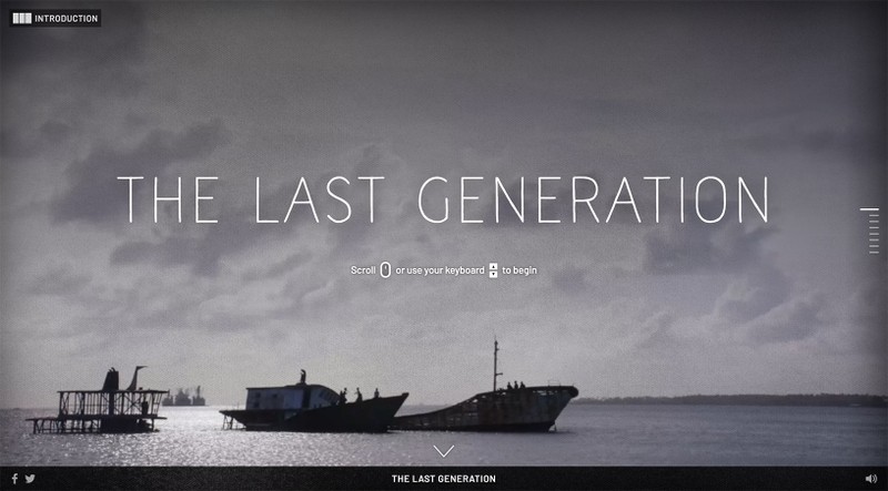
The Last Generation is an interactive documentary about the threat that climate change poses to a vulnerable island nation and the people who live there. The project was written and produced by Michelle Mizner and Katie Worth. They went to the Marshall Islands in 2017 as video producer and reporter, and they talked with children about their plans for the future. We crafted an experience that tells their story.
This project was a collaboration between FRONTLINE and The GroundTruth Project.
The Story
We framed the story of climate change on the Marshall Islands through the lens of three kids living there.
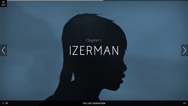
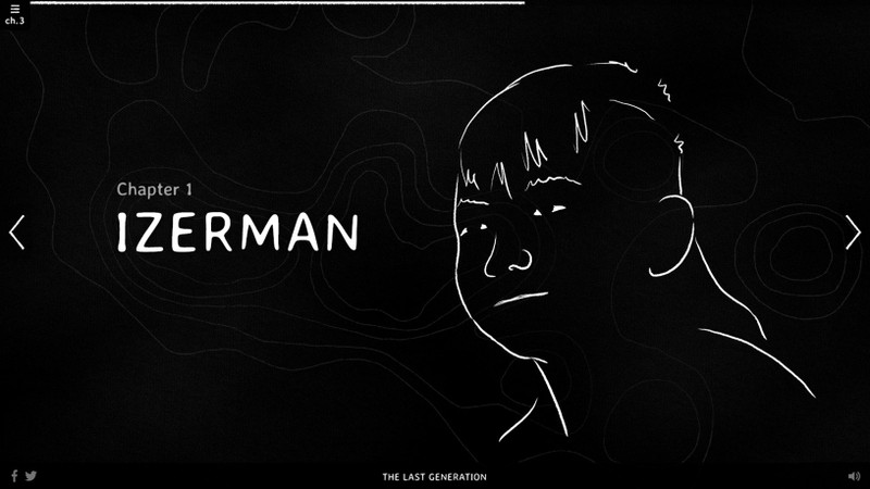
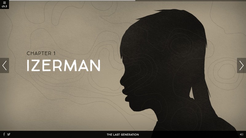
Izerman: His personality is rooted in the present and his family was considering whether or not to stay on the island—we show how sea level rise is affecting the island now.
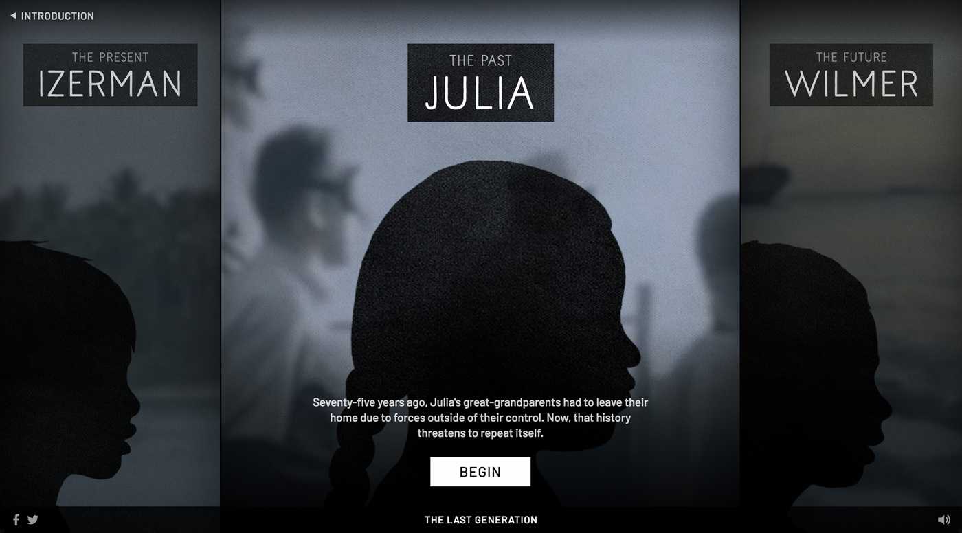
Julia: She feels a deep connection to an island she’s never been to. Her ancestors had to leave their home island in the 1940s so the United States could conduct nuclear testing there. We explore this history and the impact it still has on the Marshall Islands today.
Wilmer: He is dedicated to preserving the Marshall Islands and planning for his future there. We explain the projections for sea level rise in the 21st century and how long Wilmer's generation has to live there.
The Experience
Our team decided that an interactive documentary experience would work well to immerse the audience into video while also allowing the opportunity to dig deeper into complex science information.
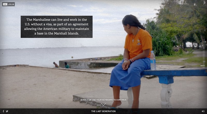
My work on this project started with a phase of early experimentation and prototyping around the structure and flow of the experience. Our first prototype was a longform scrolling experience. We learned that the scrolling felt unnecessary because the text was very short and the content for each moment fit nicely on a single screen. We landed on a slideshow format where the user can tap to advance a slide, scroll on a desktop or use a keyboard.
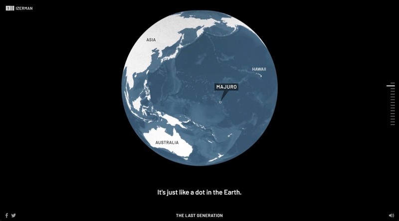
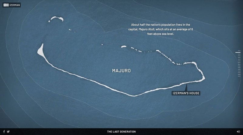
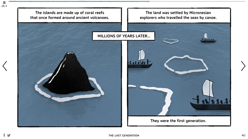
We combined graphics and animation to explain climate change science and to map out the location of this tiny set of islands in the middle of the Pacific. The islands in the Marshall Islands are actually coral atolls. Over time, coral can build up around the outside of an island. Then the main island can erode and disappear underwater, leaving only the coral reef in the shape of a ring. This becomes the coral atoll.
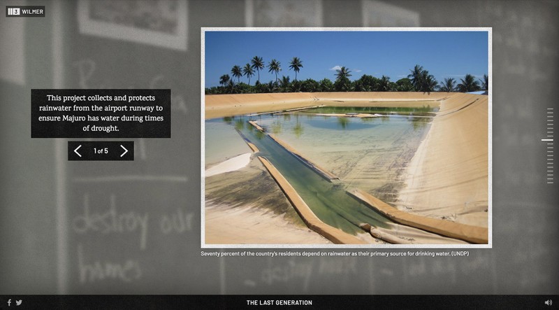
We chose a linear format with moments of interactivity. Image galleries offer a chance to lean in and tap through many examples.
This gallery shows efforts on the islands to mitigate drought and flooding.
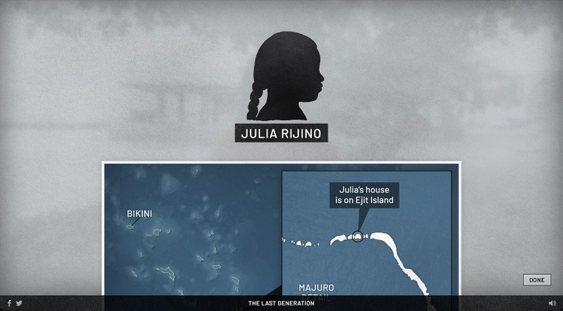
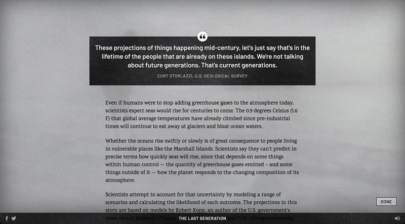
Overlay screens provide an opportunity to read more about the kids, their locations and the science of climate change. These screens allowed us to make some of the more complicated information available to those who had the time and interest to view it, but they don't slow down the main experience for those who want to move forward.
The Visual Design
Our challenge was to come up with a style that could integrate text, video, illustration and data into a seamless and elegant experience. We looked at many directions along the way that could achieve this.
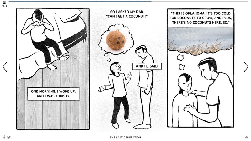
There was interest early on in exploring a graphic novel approach—one that could integrate illustration and video into a comic-inspired look and feel. We brought on an illustrator who was comfortable working in this style, Erik Nelson Rodriguez, to help us explore illustration directions. He and I both worked on illustration and design directions early on.
I continued to develop design directions that combined illustration, photography and video.
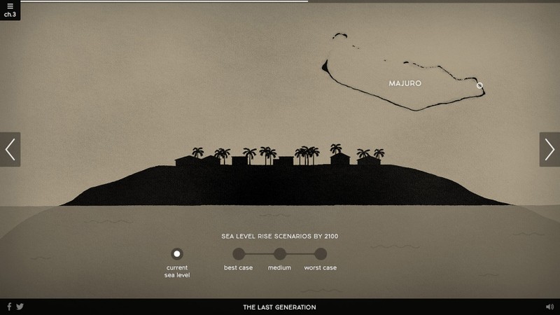
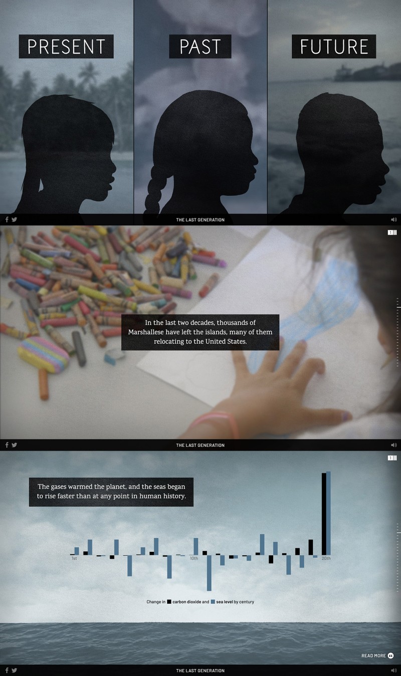
This direction uses photographic textures with simple black silhouette illustrations. The typography has some hand drawn elements but is still clean and condensed.
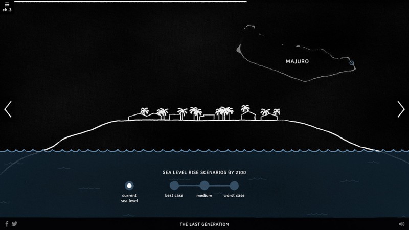
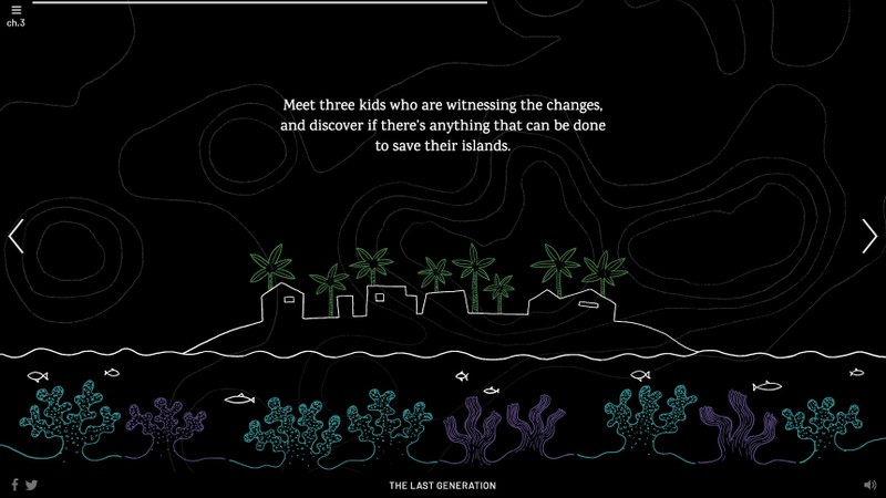
I explored another direction that was hand drawn with comic-inspired typography. The white lines on black were a reference to chalkboards from the kids’ classrooms. This direction was promising because the white lines could animate on top of video more naturally, providing a device to transition from a video scene to illustration.
Bathymetry refers to the depth of the ocean floor. I used bathymetry data from the Marshall Islands to create a background texture with bathymetry lines for this design direction.
It was important to create a seamless experience between video and illustration so the moments that were more explanatory felt like a continuation of the narrative. Early on in our process I experimented with ways to animate illustration onto the screen as a way of transitioning from a video scene into a graphic.
I also played with adding video directly to illustration.
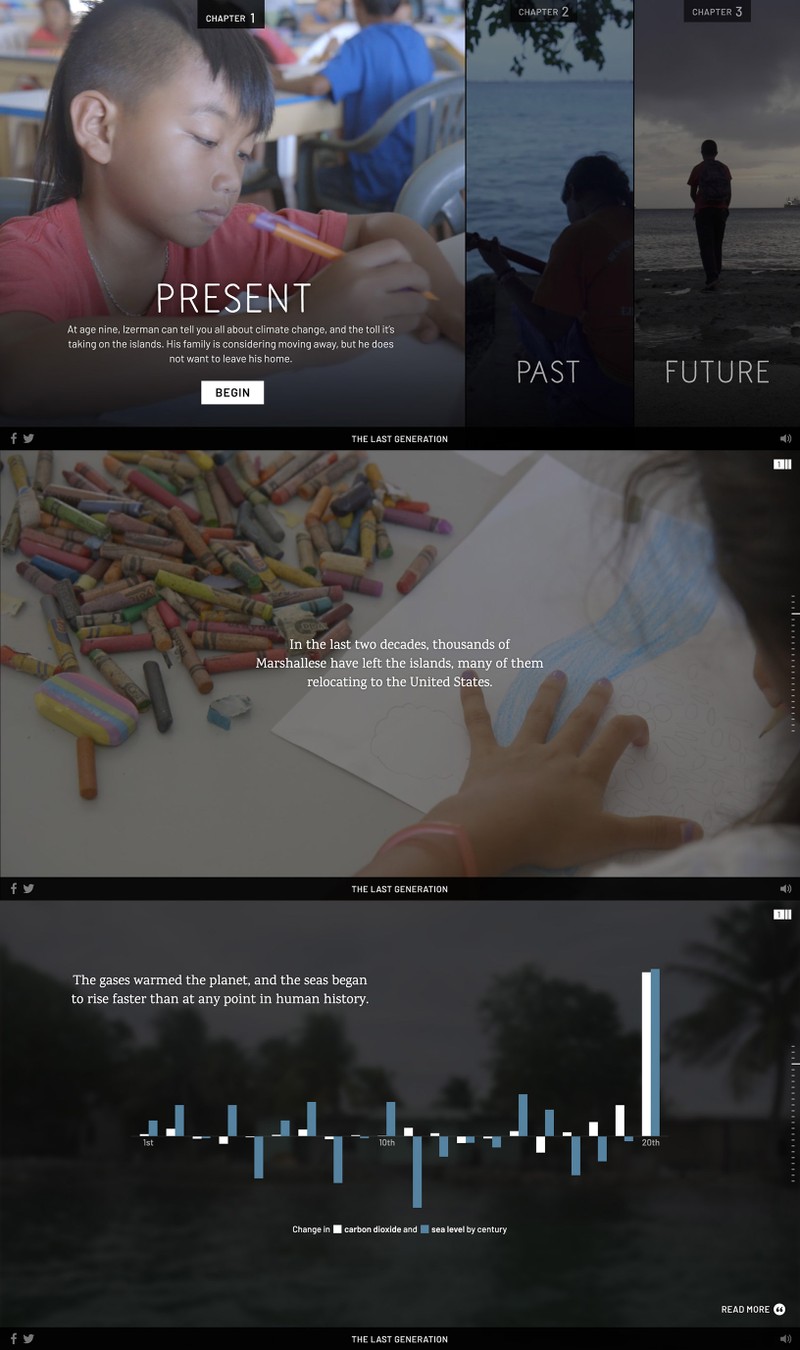
After an iterative process of design reviews and tweaks our team was leaning in the direction that used photographic textures combined with black silhouette illustrations. However, I did want to give the white line direction one last shot. I attempted this direction in a style that was more sophisticated rather than childlike.
It was a worthwhile exploration but it still did not feel right. So, we decided to present two final design directions to our executive producer: One that was based on textures and black silhouette illustrations. And another that was a cleaner and more minimal approach, a direction that would be more typical and safe for the FRONTLINE brand.
Our executive producer chose the direction that our team was the most excited about, the one with textures and black silhouettes. This direction also gave us a very natural way to tie everything together with a visual device. I could use the black texture style for illustrated moments and as a background for text during video scenes.
I looked at different typographic palettes as the illustration and design direction evolved. What began as a search through heavily comic-inspired type ended in a direction that was cleaner yet still with an organic feel.
I knew that the typographic system needed to work for different parts of the experience. Here's what I needed: A headline typeface with some personality to be used for main titles. Text that would communicate the main story in our narrative voice. And a workhorse typeface for subtitles, graphic labels and interface elements.
I chose three typefaces that have similar characteristics between them so they feel connected, but they're each uniquely suited for their purpose in the system and distinct from one another.
Naive Line Sans is hand drawn yet still feels clean and elegant due to its lighter weight, condensed width and consistent strokes. This type works well to display the main title of the project and acts as a major branding element.
We chose Karma for the narration text—the main text that communicates the story in FRONTLINE's voice. Karma clearly stands out with its serifs. This distinction works well to let the viewer know that the story is continuing. Karma has slightly rounded serifs and a hint of a brush stroke which provides a hand-drawn connection to the title typeface above.
Barlow feels more utilitarian so it works well for interface elements and informational text. However, it does have rounded corners that give it a softer feel and help it fit within a system of typefaces that all have some organic characteristics.
The typography felt more natural overall when paired with a textured background so I used a canvas brush texture throughout the experience. This gives all the screens a softer, organic feel and helps connect the illustration, video and typography together. The color palette features a dominant blue with other desaturated colors pulled from video scenes.
The Graphics
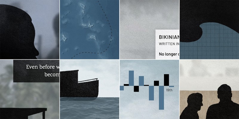
We use graphic sections to explain the science behind climate change concepts in each chapter. They have a common aesthetic—using black silhouette illustrations and photographic textures—but each one is unique and set in an abstract environment inspired by the previous scene. This helps connect the graphic section with the video scene and allows the story to continue in a more fluid way.
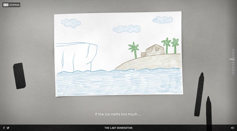
The first explanatory graphic section is about the effects of sea level rise. This graphic comes after a scene with kids in a classroom making drawings about climate change. So, the illustration continues that context by starting off with a kid’s drawing. Here, we see an illustrated view of how Izerman is thinking about melting ice and sea level rise.
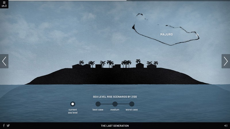
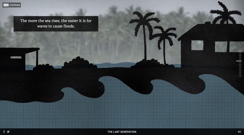
The scene transitions to a side view of an island. I incorporated a graph paper texture in the water to continue the reference to the classroom.
The background of the scene is a video with animated trees and water. The scene changes as the user moves through different steps.
Waves are layered on top as a separate element and are animated with CSS. We explain that rising seas can cause increased flooding on the islands. The frequent flooding could force residents to move away even before the sea level rises up over the island.
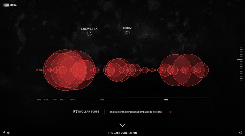
Julia’s story involves the relationship between the United States and the Marshall Islands and the history of nuclear testing there. Julia’s family is from Bikini, which was bombed in the 1940s and 1950s along with another nearby island. The residents were evacuated at the time, but drifting radiation caused hundreds of people on nearby islands to get illnesses and radiation burns. Bikini has been unsafe to live on since. Julia lives on another island called Majuro, the most populated one in the Marshall Islands, where Izerman and Wilmer also live.
We wanted our audience to experience the lasting impact that this nuclear testing had on the Marshall Islands. Just looking at the raw data was startling, so we decided that simply visualizing the size and number of bombs would be the most impactful.
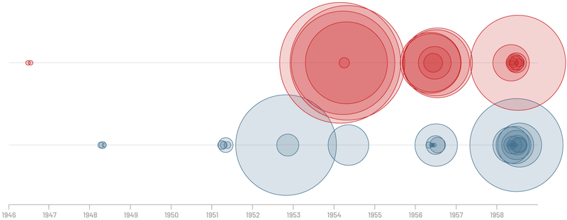
I started sketching out the data. First I plotted circles along a timeline. The circle area reflects the energy yield of each bomb. Here, they're plotted at their exact date on the timeline. There were two islands where the bombings took place, so I separated those into two rows.
The bombings were clustered together in certain years. This was the most accurate picture of what happened but it wasn't that effective because many of the circles were overlapping—you couldn't really see how many there were.
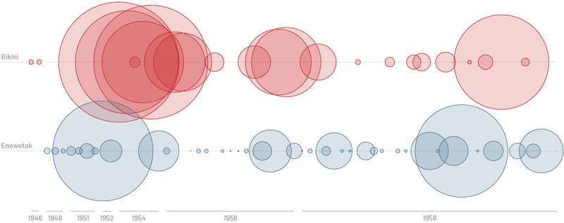
Next I plotted the circles equally spaced apart in a row, which distorts the time scale. This made it feel much more powerful. You can see all the individual bombs more clearly. Our team decided that the distortion of the time scale was editorially acceptable since the exact dates were not important to our story, we were mainly trying to stress the size and overall number of bombs.
Separating the islands into two rows added unnecessary complexity. A single row of bombs was a cleaner presentation and would have a greater impact.
I added a subtle map of the islands in the background of the final graphic scene. As the bombs animate on screen each island lights up where the bombing happened. The user advances through the scene, each swipe or tap drops a years worth of bombs at a time.
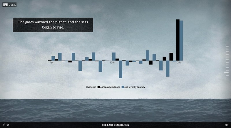
Also in Julia’s section of the story, she talks about climate change being caused by people. She says, “we brought gasoline in the boat one day, started the engine, the smoke go up, and went to the atmosphere.” We used her description as an animated transition moment.
An illustrated boat rides across the waves while realistic exhaust billows from the top. This combination of illustration, photographic textures and animation is the effect we were trying to achieve throughout the graphic sections—it continues the immersive feeling of the previous video and transitions into a data presentation. The boat passes across the screen and reveals a chart comparing the history of CO2 emissions to sea level rise.
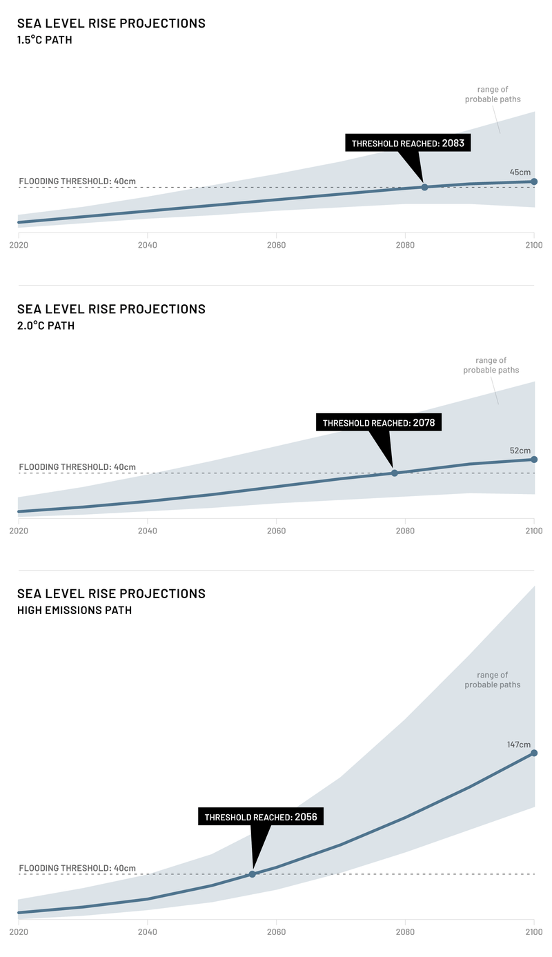
In Wilmer’s chapter we explain sea level rise projections through the end of this century. Our team examined the data closely and interviewed experts responsible for putting the projections together. These projections are based on different CO2 emission scenarios—more emissions means a higher global temperature rise and a higher sea level. I started to sketch out the data for these projections alongside a threshold for flooding on the Marshall Islands. This threshold is the sea level height that would likely result in major annual flooding. Based on the threshold and projections, we were able to determine the likely number of years the kids had left to live on their island.
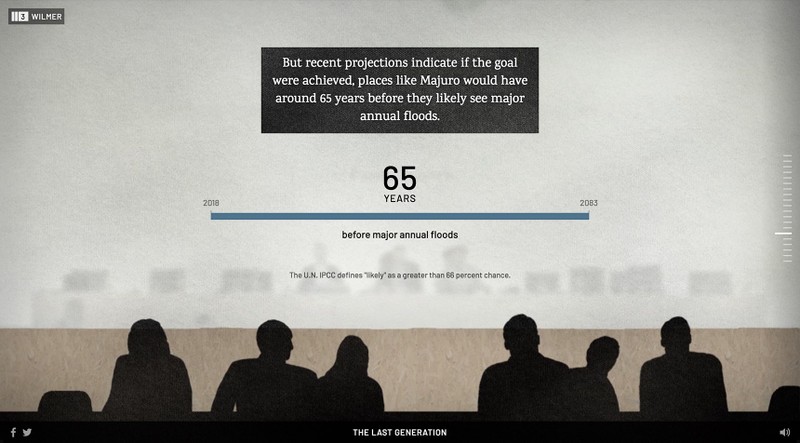
These charts are difficult to interpret even with a lot of hand holding. We decided to take a different approach and simply emphasize the number of years that the kids have left.
The emissions scenarios are determined in part by an agreement made at the Paris climate conference in 2015. Our graphic section comes after a video scene from the conference, so we continued this scene into an abstracted version of the conference to display the projections.
Thank you
It was inspiring to work with masterful reporters and storytellers on this project. The visuals and the interactivity were hand crafted to support and enhance the story. This was able to happen because of a team that was dedicated to delivering a unique experience worthy of showcasing this story.
